
Right before the first day of the 2013-2014 school year, Fieldston launched a re-vamped Ecfs.org website, with a completely new design and reorganization of content. According to the school’s Director of Technology, Jorge Vega, the major overhaul was conducted through Silverpoint, “a firm with extensive experience in building and redesigning websites for independent schools.” The re-design began in September of 2012 and “included a week long school visit in which the Silverpoint team toured both campuses and interviewed faculty, students, parents, staff, and alumni to get a sense of the ECFS experience,” Vega said. The new website is much more modern compared to the site of years past, but the response to the upgrade has not been entirely positive.
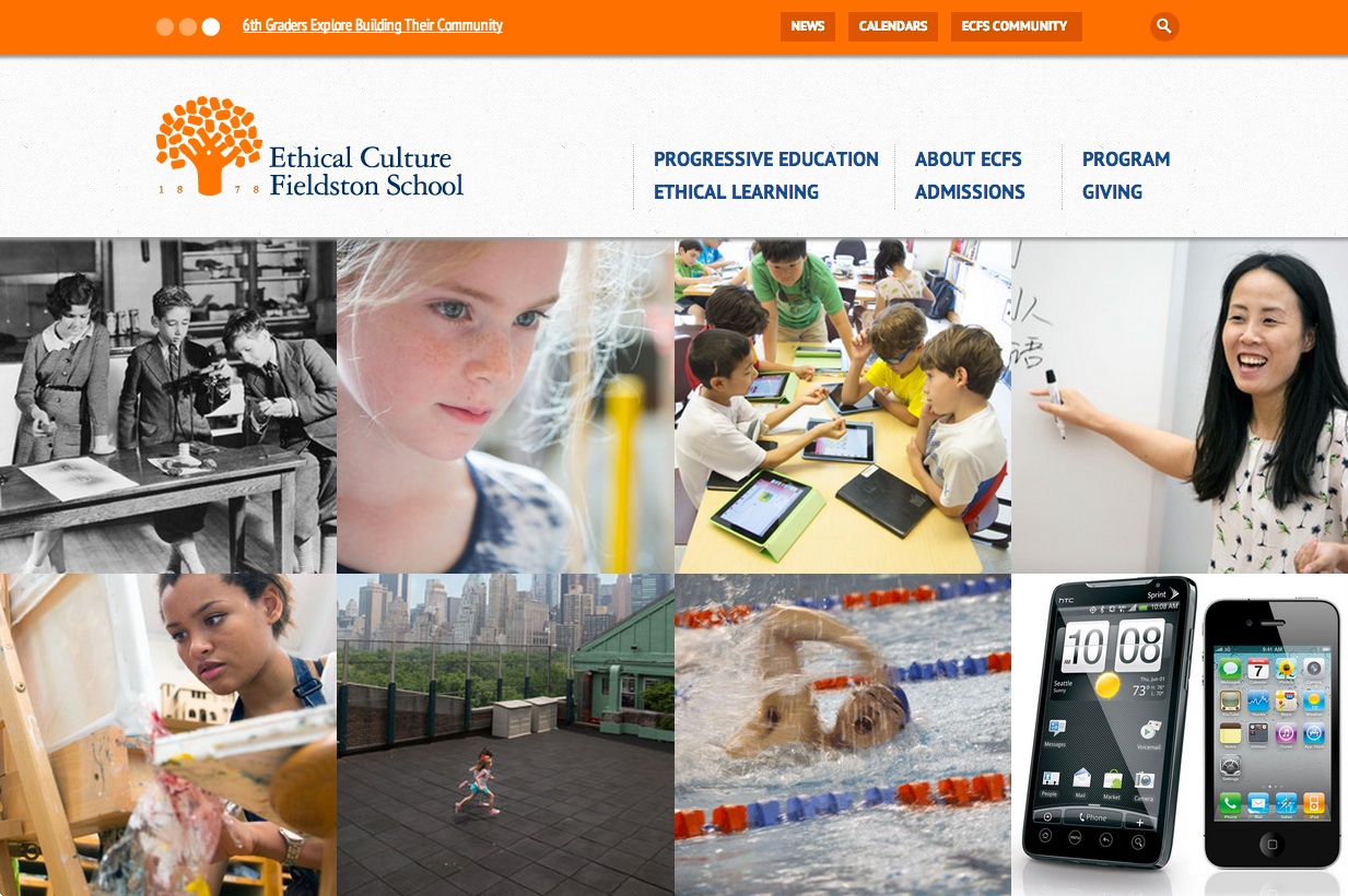
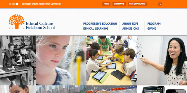
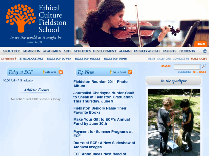
The new homepage displays the ECFS logo in the upper left corner and a central bank of twelve large photo tiles, reminiscent of Pinterest’s user interface, which link to different sections of the website on Students, Academics, Faculty, etc. The predominately blue palette of the old website was discarded, replaced by orange and white navigation controls and white text with blue headers and links. However, some important features are missing from the homepage now, such as unified athletic schedules and calendar highlights. While the old website immediately and clearly presented information on homepage, the new site uses all of the homepage real-estate for links which navigate a user to that same information, across multiple steps.
Referring to the new design, David Fishman, a Form V student said “There’s only one word I can use to describe Fieldston’s new website: fresh. The design and navigation of the responsive, metro-styled site is bold, bright, and modern, just like the school it’s representing.”
In the recently released Strategic Plan for Ethical Culture Fieldston School, under Nurture and Sustain Our Resources, a new website is listed as a priority. The stated goal is to provide “an increased ability to draw information of personal interest…” for students, teachers, alumni, and prospective community members. In an interview Mr. Vega said “A school’s website should be dynamic. It serves as a valuable resource for school news, events and information for the entire community…” He went on to mention the school’s ongoing digital commitment, which includes an iOS and Android app to be released “by the end of this month…[which] will offer mobile access to online info, news subscription and notification options and one-click access from the app directory…” Demonstrating the appeal of mobile apps to the student body, Fishman said, “The only thing I feel we’re missing now is a mobile app, which I understand is on the way.”
By using Silverpoint as their content management system, the school has more freedom to edit and change the website’s functionality. Mr. Vega said, “The system opens the door to other opportunities as well. FieldNotes has been re-launched as a digital bulletin that goes out to families on the weekly basis.” Similarly, Vega notes that the school has launched a new Twitter feed (@ecfs1878) in a continued effort to extend the ECFS communities’ outreach.
During the first few days of school, many faculty members and students were surprised by the arrival of a radically different website and expressed concern about its usability and depth of substance. In an interview, one Form V Student said, “I personally have found that the new website layout is a bit difficult to navigate my way around. I just feel like maybe it’s been slightly overcomplicated.”
One senior faculty member said, “a lot of teachers are really disappointed by the content – it’s light.” Curriculum descriptions found on the site are short blocks of text that don’t do justice to the school’s progressive teaching and learning, support for student activism, and interdisciplinary efforts. One teacher noted that some of the copy on the website is blatantly wrong and inaccurate.
Many faculty members also complained that the website read like an advertisement and is designed more for people looking at the school than those already attending it. One teacher noted “it doesn’t have the usability for people who go here.” Among the inconveniences: “We’re doing online attendance in My Backpack, but teachers no longer know how to get to My Backpack because the easy link that was on the old website is now missing from the new website…”
Mr. Vega conceded that complaints have been listened to: “The community’s feedback has also been filled with extremely insightful and constructive ideas that have already begun finding their way onto the site.” Already, elements such as clearer links to My Backpack have been added and “students, parents, and faculty are now finding it easier to navigate to frequently-used resources…” says Vega.
Even with its flaws, the new website has been described by some as a work in progress and is a step in the right direction to a more efficient and appropriately modern tool. Looking to the future of the website, Mr. Vega said “What we see now and what we see in six months should be different and six months after that, again, something different. That’s our goal with ECFS.org.”