
Editors note: This is a compilation of reviews written by various journalism students profiling the Middle School art exhibition in the Tate Library ground floor and the Arts Building. Each journalist chose 1 piece of artwork to review.
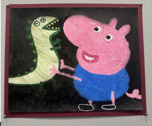
As I stepped into the Tate Library Gallery this afternoon, the piece featured above, in the back-right corner, immediately caught my eye. If the essence of my childhood could be captured in a piece of artwork, it would be the piece featured above. From the toy little brother George is holding to the pigment of the color in which this piece is engraved, this graphic has been engraved in my mind. Standing before this excellent piece brought back a warm sense of nostalgia. Some of my most fond childhood memories have been shaped by this show. My sister and I used to imitate Peppa Pig’s accent and that of her family. I would impersonate Peppa, and my sister would impersonate George. This piece of artwork successfully captures the warm humor of my childhood. I give it a 10/10. – Mia Tuchman
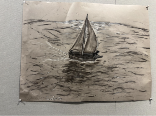
This middle school oil pastel piece really stood out to me. I love how there were no colors used and the artist used a vibrant white, which is typically taboo in the art world, to highlight some waves as well as parts of the boat and dog. It really draws your eyes to the center of the artwork, the sailboat. I love how the waves seem to be placed randomly around the page, yet somehow you can clearly see the shape on the surface of the water, with the little drawn waves working together to form large waves that allow you to really envision the ocean. The slightly crumpled aspect of the paper somehow adds to this ‘looking between the lines’ aspect of the drawing, adding dimension and making the artwork – especially the subject – pop out at you. When the drawing is pushed back against the wall on the sides the waves start to disappear, creating a sort of vignette feeling. The shadows blended into the waves under the sailboat seem to line up with the shadows cast under the paper onto the wall, though this may have been an accident, adding more depth. I also loved the dogs on the sailboats; without this addition the drawing would be extremely realistic but the dogs add a touch of humor, one even at the edge of the boat seemingly focused on its journey ahead. I found this piece of artwork extremely impressive, and discovered that the longer I looked at it, the more details I noticed that I never otherwise would have. -Sylvia Weinberg
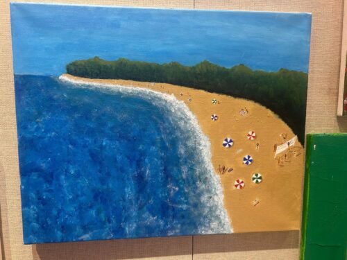
This student’s art spoke to me across the wall of different shapes, sizes, colors, and strokes that demonstrate minds of endless creativity and imagination. The image looks like a photo taken on a perfect sunny day in July at Cooper’s Beach in Southampton. There are families flooded all around me. I see a world of different people: a young couple laughing over an uno game, a kid crying over a fallen ice cream cone, a woman pulling her dogs leash away from another dog, a swimmer splashing his arms. Oh how I love summer. Oh how perfectly this piece of art captures it. From the deep blue water, to the colorful beach balls, to the greenery behind, it looks perfect. The bright colors so superbly capture that emotion: it is not a sad blue or a dark red, rather the happy turquoise, forest green, and tan sand perfectly contrast each other, representing that feeling of joy. The artist’s choice to make the beach from a birds-eye-view is especially intriguing. Maybe this is a bird, looking for fish to prey on in the ocean? Or maybe that same bird is looking for a bag of chips on the sand to tackle? Maybe it’s a plane that is advertising a big banner. The artist creates an astounding sensation that the viewer is flying up above the beach, viewing everything within it, from the sand, to the trees, to the ocean. -Lila Newman
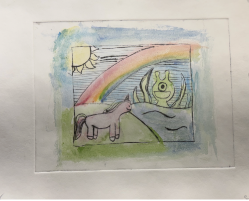
This watercolor painting by Sophia Kovall presents a dreamlike landscape that uses the emotion of childlike whimsy, proving to be a basic, intriguing piece of art. The paper is carefully divided into gentle yet opposing colors: the warm left side with the sun, a grassy hill, and a unicorn-like figure contrasts with the cooler right side featuring water and a strange, one-eyed creature, providing a unique tension between light and dark. The soft watercolor wash creates an ethereal atmosphere, while the visible ink outlines add structure and intentionality, preventing the piece from feeling overly loose. Although the forms are simple, this simplicity strengthens the symbolic quality of the work rather than detracting from it. As it stands, the piece succeeds in evoking curiosity and imagination in a visually engaging way. -Isaac Leftcourt
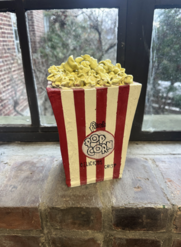
This piece stood out to me because the student took something familiar, movie theater popcorn, and turned it into art. The art and details used to make this immediately remind me of sitting at the movie theater on a cold and rainy night. The popcorn on the top, almost spilling out, really reminds me of the popcorn handed to me at the movie theater slowly falling out before even making it to the theater. The quick stop at the butter station before reclining my chair to watch an amazing movie. At the same time, the fact that it is not moving and will always be filled to the brim is ironic because everyone knows the minute you are handed the bucket of movie theater popcorn it is gone before the movie even starts. Overall, this is not a piece of art that you see often, but looking at it will draw you in quickly. -Sloane Feinberg
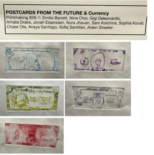
This collection of reimagined currency brings a lot of personality to the library walls, turning something as “adult” and rigid as a dollar bill into a showcase of what Fieldston middle-schoolers actually value. It’s fun to see how they kept the classic structure of a dollar, like the intricate borders and serial numbers, but replaced the historical figures with things like basketball, meditation, and personal bedrooms. The green “Twenty” bill featuring a bedside lamp and the phrase “In sleep we trust” is a standout for how it humorously flips a national motto into a relatable kid sentiment. Using bold colors like deep purples and reds instead of just money green gives the whole display a high-energy, DIY feel that makes the standard US dollar look pretty boring by comparison. – Otto Ahlers
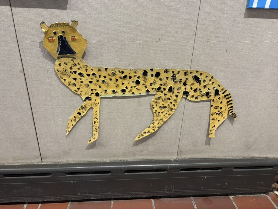
This unique piece of artwork hangs in the 300s building, just outside the ceramics studio. Because the jaguar isn’t on a canvas like most of the traditional oil paintings draped across the wall, the piece stands out. It appears the artist used a combination of painting straight onto the paper and pasting other 3D pieces onto the body to represent the spots and the nose, which are made out of cardboard or a thick cardstock. The contrast between the vibrant yellow background and the jet black spots that rise from the animal’s body contributes to the overall dimension and lifelike nature of the cheetah. The artist did an impressive job of crafting the agile shape of the animal, especially since it seems they were cutting the figure completely from scratch. This artwork serves as an inspiration because of its creativity and the methods of art the artist used; I’ve looked through the entire 300s gallery and have yet to see a piece as outside of the box as this one. -Layla Finn
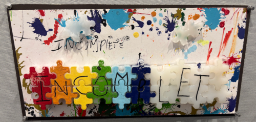
As I prepare for finals week, I am constantly reminded that much of my studying and writing is far from finished. From a broader perspective, at 18 years old, almost everything in my life is actually incomplete. My education is incomplete, my development is incomplete, and of course the wisdom I will accumulate over the course of my life is incomplete as well. This piece reflects that reality: whether it is a blank piece of paper or a 99.9 percent finished work, only missing a final brush stroke, it is still defined by what remains unfinished. That is why it is relatable to every single person who walks by. No matter where they are in their life, there is always something unresolved or incomplete. – Alex Babej